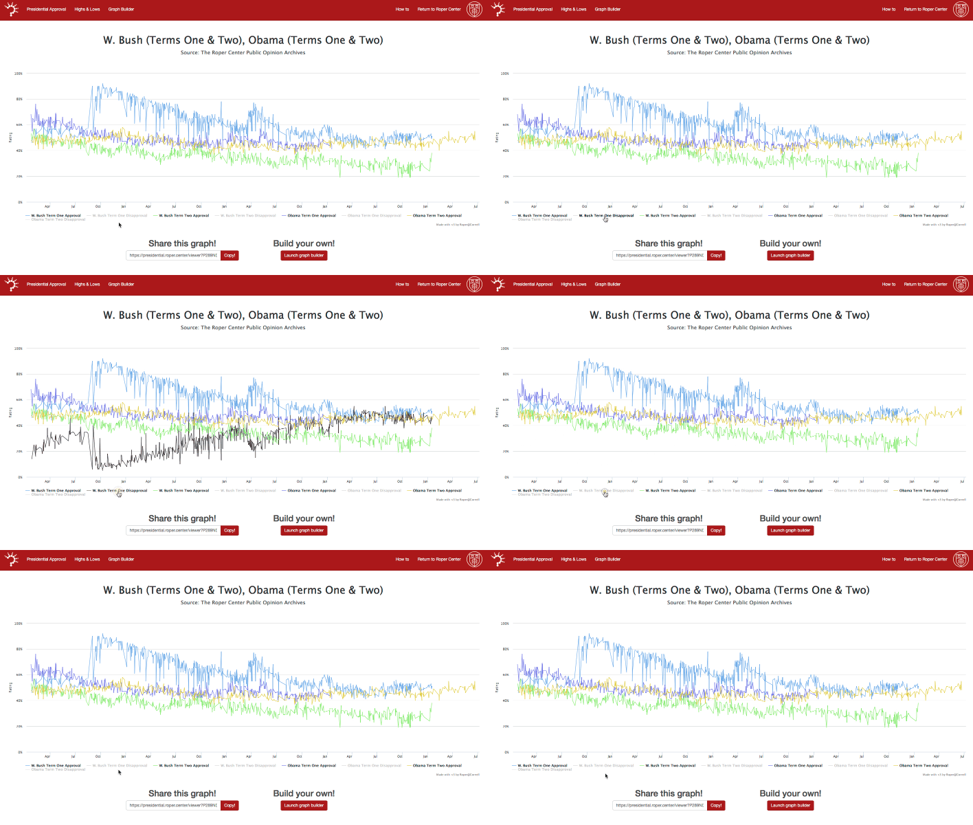
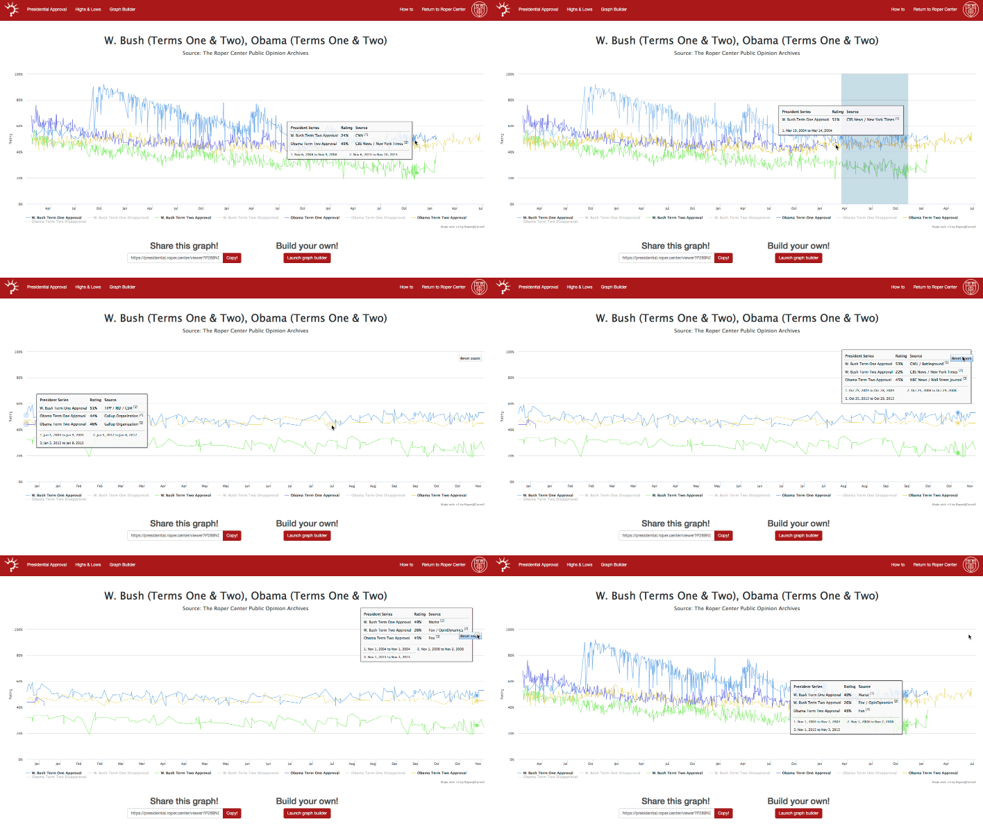
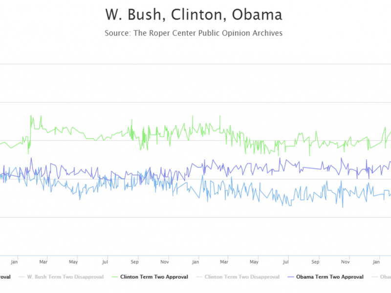
How does presidential approval in Barack Obama's second term compared to that of George W. Bush? How about to Harry Truman? With the Roper Center's newly redesigned Presidential Approval Ratings tool, users can easily create graphs to compare approval ratings of up to three presidents across their terms. Once a graph has been generated, you can zoom to see a close-up of a particular time period, hover over individual data points to see the citation information, and share your graph with others. Show and hide data: 
Zoom to a date range:

Data from Roosevelt to Obama is available. Want a spreadsheet with the complete data for your own analysis? Users at member institutions can contact roper-data@cornell.edu.
